What color is khaki? Guide for miniature painters
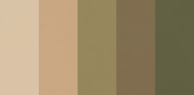
If you ask ten modelers what color is khaki, you will most likely get ten different answers. For some, it is a yellowish sand tone; for others, an earthy brown; and for fans of modern uniforms, a desaturated olive green. This ambiguity is no accident but the result of more than 150 years of military history, changes in dyeing processes, and the adaptation of armies to different theaters of operations.
In general terms, khaki can be defined as a set of colors identified as "khaki tones" whose common characteristics are that they are considered tertiary, desaturated colors, formed by grayish browns that can have greenish, yellowish, or reddish tints depending on the proportion in which they have been mixed. Despite being desaturated colors, they are not considered pastels since pastels come from mixing primary or secondary colors with white, resulting in luminous shades. This differs from the khakis that appear after mixing tertiary colors (obtaining brown and grayish colors) with white. Additionally, they all contain black or deep blue.
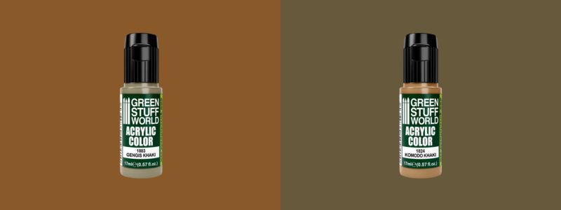
In the world of miniature painting, precision is fundamental. We don't just paint a color; we paint a historical context and a scale. Understanding the nature of what color is khaki will not only enrich your knowledge of uniformology but will also allow you to choose correctly among the options we offer at Green Stuff World, such as Gengis Khaki or Komodo Khaki, each designed to represent a different facet of this chameleon-like color.
The etymological and military origin of khaki: The color of dust
The word "khaki" comes from the Persian term khâk, which literally means "dust." Its entry into military history occurred in the mid-19th century, specifically in 1846, by the hand of Lieutenant Harry Lumsden, who commanded the Corps of Guides of the British Army in India. At that time, British uniforms were bright red—a heroic color but disastrous for camouflage in the arid borderlands.
Lumsden, seeking a practical solution, dyed the white cotton tunics of his soldiers with a mixture of mud, tea, coffee, and wild berry juice. The result was a dull, yellowish, and earthy tone that blended perfectly with the dusty terrain of the region. This was the birth of what color is khaki as a camouflage concept. What began as an improvisation on the battlefield ended up becoming the standard for colonial troops and, later, for almost all the armies of the world during the Great War and World War II.
It is important to note that the original khaki was a purely functional color. There was no single chemical "recipe," which gave rise to a huge variety of nuances, especially when replicated in other countries. This is why, when looking at old photographs or museum uniforms, we see everything from almost ochre tones to light browns. It is also the reason why so many people ask themselves, "what color is khaki exactly?" In modeling, this variability is our ally, as it allows us to play with different shades to represent wear and tear and sun exposure on our figures.
Pigment chemistry and the scale effect
And from the point of view of color theory, what color is khaki? According to color theory, khaki is a complex mixture. It is neither a primary nor a secondary color; it is a tertiary tone that moves in the spectrum between yellow, orange, and gray with low saturation. In terms of pigmentation for modeling, it is usually achieved by mixing cadmium yellow (one part), cadmium red (⅓ part), white (3 parts), and a pinch of blue to "dirty" the mixture and give it that neutral character.
On the other hand, an aspect that every painter must consider is the scale effect. This happens when applying the shade of an original color to a reduced-scale model, causing the colors to appear dark and with too much contrast. To prevent this from happening, it is advisable to lower the intensity of the shades by adding a small amount of white. The larger the scale, the higher the proportion of white paint. This is because the amount of light reflected by a small surface is less. As a reference, you can use the 1/48 scale, for which you will have to add 10% white to the paint you want to use.
This is where the importance of having high-quality pre-mixed references comes in. Mixing your own khaki every time you paint a regiment can lead to visual inconsistencies. Using stabilized acrylic paints ensures that all your soldiers share the same visual identity, something essential in strategy games or large-scale dioramas.
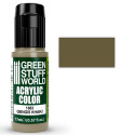
Gengis Khaki Acrylic Paint
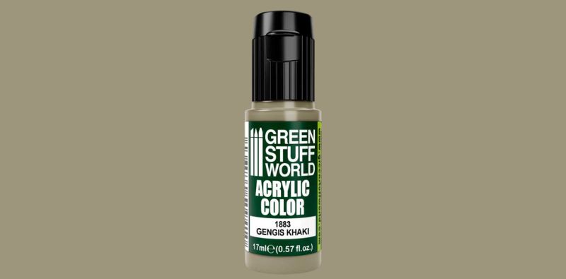
When we seek to represent that classic, earthy, and warm khaki that recalls the steppes or the uniforms of desert campaigns, the essential reference is Gengis Khaki acrylic paint. This tone is a perfect representation of the "browner" side of the color.
It has medium-high desaturation within the range of neutrals, making it ideal for:
• British and American uniforms: especially for WWII service jackets and trousers.
• Arid terrain: it is an excellent base for rocks and desert soils that are not purely yellow.
• Worn leather and fabric shoes: mixed with a little black, it serves to represent greenish-brown leather or fabric boots that have lost their shine and are covered in road dust.
This color is not simply a pigment; its Maxx Formula ensures superior opacity, allowing each brushstroke to capture the essence of arid and tactical environments with amazing fidelity. A visual texture is perceived that evokes the resistance of military materials and the sobriety of nature. Furthermore, it is a perfect link between dark greens and warmer browns, allowing smooth transitions in complex camouflage patterns.
Komodo Khaki Acrylic Paint
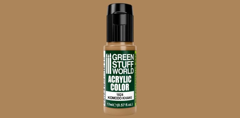
If Gengis Khaki is ash and desert, Komodo Khaki is pure earth and campaign. This color moves away from the gray palette to enter the family of warm browns and deep ochres, evoking the solidity of clay-like terrains and natural pigments.
It is essential for modelers looking to represent the robustness of classic materials or equipment that has just entered combat. Unlike faded tones, this one captures the vibrant pigment of new canvas or treated leather, offering a base with great visual strength.
Its most recommended applications include:
• Shadow and Basecoating: It is the perfect color to create the base upon which to highlight. Its warmth provides a natural depth that makes transitions in clothing folds look organic and realistic.
• Historical equipment: Ideal for recreating Soviet canvas satchels and WWII equipment covers that still retain their original factory dye.
• Damp terrain effects: Its saturation makes it an excellent choice for painting beaten earth paths, dense mud, or areas of still life in dioramas that require a marked contrast.
• Organic materials: it works wonderfully as a base coat for treated wood, tool handles, and worn leather.
How to paint khaki uniforms step by step
In modeling, it is not enough to just stay in theory and know what color is khaki; it is fundamental to know how to use it in practice. Achieving a professional finish on a khaki-colored surface requires understanding how light and shadow behave on such a neutral tone. If you simply apply a black wash over khaki, the miniature will look dirty and "muddy," thus losing the richness of the color.
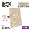
To copy the aesthetic of a camouflage uniform with these tones, first apply a black primer to your soldier. Light colors, earth tones, or similar shades like Sandstorm or Deck Grey can be used as a base coat for the camouflage with an airbrush. To create shadows, use very diluted Gengis Khaki with a wash consistency, perfect for letting the pigment seep into the folds created by the fabric, giving the feeling of shading at key points. Now it's time to highlight the uniform by simulating the effect of light while avoiding the darkest areas shaded with the wash. Remember to dilute the acrylic paint well so that the brushstroke is not too marked, as we have taught you in our tutorials.
Once highlighted, it is time to draw the camouflage. Komodo Khaki is perfect for painting the base of the camouflage spots in the form of small lines. Mix the base color with white to make small dots near the lines, then partially cover them with another black line that follows the pattern of the dots irregularly on each one (bottom, top, or sides). All that remains is to paint the rest of the figure's elements, such as the shoes, the backpack or satchel, or the weapon the soldier is holding.
There are many types of camouflage uniforms; you can even invent your own with different colors and patterns. By combining other tones and shapes, you will obtain a great variety of camouflage styles with both khaki colors and any other, although they would cease to be faithful to reality.
Ultimately, khaki is a very versatile color because of the great variety of tones it can represent. Therefore, to the question "what color is khaki?" a single answer cannot be given; it depends both on the context and the gaze of the artist who is painting. It can range from more neutral tones like Gengis Khaki and Komodo Khaki to a military green (or khaki green).
As a modeler, your task is to decide what story you want to tell: what point in history your soldier is in and what color is khaki most realistic for their context. So that you can bring all your projects to life, at Green Stuff World we offer all the high-quality tools and products you need.
Share this content